|
Tight
Shadows
Tight shadowing
is the easiest to later make into a transparent GIF or to overlay on top
of some other image. The shadows are opaque and in a single hue. This
is the best shadow to use for smaller items, such as a signature file, or
for any item that may be used on many different colored backgrounds. Also,
this type allows you to be creative without adding a bucketload of bytes
to an image.
|
Step
1:
Prepare your text on
a contrasting background color. It doesn't matter
 what color
you use for the background, just as long as it is dissimilar to the color
you plan to use for the text. what color
you use for the background, just as long as it is dissimilar to the color
you plan to use for the text.
Step
2:
Make a copy of this and change
the text color to a darker shade (close to black) of the same hue.
|
Step
3:
Letting the background go transparent,
paste the colored text over the darker version. Allow one or two rows of
pixels of the darker version to remain visible at the bottom and on the righthand
edges of the letters. (Zoom in closer to get a precise alignment.)
You're finished! It will be no trouble
at all to crop this item down and make the background color transparent if
you want. You may also, depending on the image, be able to reduce
the palette to as few as three colors which will drop the byte
count significantly for the final file.

This image was created in Windows
Paintbrush
following this "by hand"
technique for tight shadows.

This image was created in Paint Shop Pro,
using the special drop shadow feature with
opacity at 255 and blur set to 0.
|
More
Shape
Take this same text and give it
even more shape. Start with the two versions as above, one the color you
want the text to be, the other a much darker version of the same hue. Make
a second copy of the text in the color you want and set it aside. Make another
copy of the text and alter the color to be a much lighter shade (almost white)
of the same hue. This becomes your highlight version. (Just in case that
wasn't clear, you should have four copies total: two in the text color, one
in the shadow color, and one in the highlight color.)
Follow Step 3 above.
 Letting the background go transparent, paste the
highlight version over the item you completed in the step above. Offset
the highlight by one or two rows of pixels to the top and lefthand edges
of the lettering. Letting the background go transparent, paste the
highlight version over the item you completed in the step above. Offset
the highlight by one or two rows of pixels to the top and lefthand edges
of the lettering.
Now take the second copy of the color version and paste it over the top of
the others, letting the background go transparent. Align it with the color
version that was already there (but was mostly covered by the highlight
layer).
|
Done again! Now you
have both shadow and highlight, which grants even more of a shaped
appearance to your text.

This image was created in Windows
Paintbrush
following this "by hand"
technique for highlight shaping.

This image was created in Paint
Shop Pro,
using the special drop shadow feature with
opacity at 255 and blur set to 0. I then switched
to the Cutout feature for the highlight
with opacity at 255 and blur set to 0.
|
Drop
Shadows
If you thought you needed a special
program or filter to reproduce one of the web's most popular effects,
get ready to be surprised.
|
 Step
1: Step
1:
Prepare two copies of your text,
one in the color you want the text to be and the other in a much darker
(near-black) shade of the background hue. Your background color is
important when using drop shadowing, because the shadow will blend with
and should appear to be part of the background itself.
|
 Step 2: Step 2:
Blur the darker version as much
as it takes to reach a very softened effect similar to the one shown here.
|
 Step 3: Step 3:
Letting the background
color go transparent, paste your colored text over the blurred shadow, offsetting
it towards your imagined light-source (upper-left is used here). That's all
there is to it! A perfect drop-shadow without any special filters!
|
Use
More Shape
It looked so good with tight
shadowing, why not try adding a shaping highlight to this drop shadow?
Follow all the same steps given above except remember to make your shadow
version a darker tone of the background hue and to blur it until it
softens.

This image was created in Windows
Paintbrush
following this "by hand" technique
for drop shadows with highlighting.

This image was created in Paint
Shop Pro,
using the special drop shadow feature with
opacity at 180 and blur set to 23. I then switched
to the Cutout feature for the highlight
with opacity at 255 and blur set to 0.
|
Selecting
Colors
Once you have your main color
chosen, it's easy to pick out your highlight and shadow tones. Typically,
the standard Windows color picker comes up, and if it does this in your paint
program, you've got it made. If this isn't how your program works, you'll
need to find another method, but this tip is still helpful to know.
Colors are based on several different elements, most notably hue, value
and saturation. I won't go into their definitions here, but when I
mention choosing a highlight or shadow of "a different shade of the
same hue," I'm speaking of changing only the value (depth) of the color,
not the color itself. Don't shift the position of the star-pointer on the
main color chart or you will be changing the hue and/or
saturation.
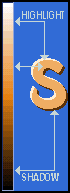 You can't go wrong if you use the vertical color
bar on the far right of the Windows color picker (shown here). Your
chosen text color is your mid-tone (regardless of where it falls vertically
on the bar). The highlight can be selected from any level above that (toward
white) and the shadow can be chosen from any level below it (toward black). You can't go wrong if you use the vertical color
bar on the far right of the Windows color picker (shown here). Your
chosen text color is your mid-tone (regardless of where it falls vertically
on the bar). The highlight can be selected from any level above that (toward
white) and the shadow can be chosen from any level below it (toward black).
Avoid picking an extreme white or black tone; get close but not too close.
The colors look more natural when extreme black and white are not
included.
|