![]()
This image was developed from an ArtExercise challenge topic.
![]()

2000:
Portrait of Raphael
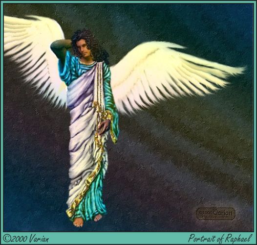
I began with Poser 2 to create the "sketch" of the naked body to work from. Following Bernini's guidelines (part of the ArtExercise challenge), I broadened the shoulders and lengthened the legs. I found I also needed to lengthen the abdomen/chest in the torso area to help keep the body looking like a real body. (I neglected to "shrink" the head.) The Poser rendering provided me with the body-lines plus the basic light/shadows. I opened it in Paint Shop Pro, selected the gray background and moved it to its own layer.
To follow Manet's style on the treatment of the background, I wanted to keep the background empty and plain, yet not boring or *too* flat. So I used KPT 2's Fractal Explorer to place a portion of a fractal image onto the background. This was colorized to dark navy tones, then run through FMPaint Engine filter to provide the brush-marks appearance, then run through FM Tile Tools Blend Emboss filter to accentuate the brushstrokes, giving them a bit of dimension. Later in the development, a KPT 3 gradient was applied to give some variation to the coloring and also to "lean" all the color tones to match up with those used in the other layers.
I use a Poser prop for the wings so that the light/shadow is also picked up appropriately on them. After setting up the background, I separated the wings and moved them to their own layer. The wings received a lot of Smudging to re-shape their form and provide a feathery edging. Then the same KPT 3 gradient was overlaid on them also.
The next step of major effort was in painting the robes, which I did on a transparent layer just above the body form. I began by blocking in the main shapes with a solid, medium tone, then went over it all several times with a 1-pixel size tool set alternately to Lighten and to Darken, building the folds of the material in small steps. When completed, the same KPT 3 gradient was applied lightly to help lean the colors and establish the sense of palette.
For the heck of it, I separated the gold trimming of the robes to its own layer, then applied a Blade Pro preset to emphasize the gold-ness. The trimming had already gone through the Lighten/Darken stages like the robes went through.
The hair emerged on its own layer by blocking in a solid shape to start, then following the same Lighten/Darken stages, building up the curls. It then also received a light overlay of the same gradient.
The hidden portions of the body were ignored. The exposed portions received a bunch of Smudging to smooth out all the skin and to shape the features of the face. I altered the main color tone several times until I found something I was satisfied with. Finally it too received the gradient overlay to lean the coloring to the palette.
![]()
![]()